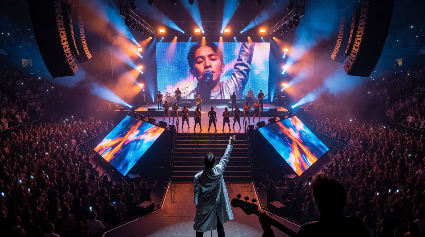
Some lighting looks arrive like a thunderclap, and some arrive like a gentle hand on the shoulder. In a composite story from a corporate awards night, the designer fell in love with drama: razor beams, saturated magenta, hard-edged pools of light that sliced across the stage as each winner walked on. The result was spectacular and slightly exhausting. Faces were hidden, cameras struggled, the CEO’s speech disappeared into theatrical shadows, and the audience started to feel that the lights were more important than the people. Spotlights that are too dramatic are a common failure of enthusiasm, and the cure is restraint.
From Limelight to Overdesign
Drama has always been the spotlight’s native language. The Drummond light of the 1820s lit performers in a brilliant circle that gave us the phrase “in the limelight.” The Vari-Lite VL1 of 1981 brought automated light to touring, and moving fixtures from Robe, Martin, Clay Paky, and Ayrton now offer beams that can slice a room into pieces. The technology makes extreme looks easy. The art lies in knowing when not to use them.
Drama Costs Something
Dramatic lighting carries trade-offs. High contrast hides faces and expressions. Saturated colors can clash with skin tones, brand palettes, and video content. Hard edges and fast movement can distract or fatigue. Strobing and flashing can cause discomfort. On camera, extreme looks cause exposure problems, color shifts, and banding.
For corporate and broadcast events, the cost is communication. If the audience cannot see the speaker, the message suffers. Drama should serve story, not override it.
Know the Purpose of the Moment
Ask what the moment needs. An awards reveal may want excitement and anticipation. A keynote needs clarity and trust. A memorial tribute needs warmth and respect. A product demo needs detail and accuracy.
Match lighting to purpose. Create a mood map of the show: which segments are high energy, which are neutral, which are intimate. Use drama selectively, so peaks feel earned.
Use Contrast Like a Dial
Contrast is a control, not a constant. Think in terms of key-to-fill ratios and background levels. For speech, keep ratios moderate, such as 2:1 to 3:1, so faces remain readable. For musical moments, allow higher contrast for depth.
Use fill light and ambient wash to soften hard shadows. Check camera exposure with waveform and false color. A look that works in the room may look harsh on screen.
Choose Color With Care
Color sets emotion, but excess becomes noise. Limit the palette to two or three main hues, and use neutral whites for faces. Test colors against skin tones on camera. Avoid saturated reds and magentas on faces, which can look unflattering.
Coordinate with brand colors and LED content. A wall with blue content and orange spotlights may clash. Use color theory: complementary, analogous, or triadic schemes. A restrained palette feels sophisticated.
Control Beam Shape and Intensity
Hard-edged beams are powerful, but not always flattering. Use frost and soft focus to gentle edges, and zoom to control size. Reduce intensity to avoid glare, particularly for speakers and cameras. Use dimmer curves that allow subtle fades.
For fixtures such as the Robe MegaPointe, Martin MAC Viper, and Ayrton Diablo, explore beam modes that suit moments. A softly focused beam can be as dramatic as a razor, without the harshness.
Manage Movement and Speed
Movement draws attention. Fast pans, tilts, and chases can overwhelm. Use motion with purpose: slow reveals, gentle sweeps, synchronized patterns. Match speed to music or speech rhythm.
For corporate shows, use movement sparingly, especially during speeches. Program calm looks for talking moments, and reserve motion for transitions and climaxes. Let the audience rest.
Consider the Camera and the Stream
Cameras amplify drama. High-contrast looks can clip highlights and crush shadows. LED fixtures with PWM dimming may cause flicker. Colored light may cause white balance issues.
Coordinate with the video director and shader. Provide camera-friendly looks for IMAG and broadcast: softer contrast, stable color, balanced exposure. Test on camera during rehearsal, and adjust. A look that suits both room and screen is a mark of experience.
Respect Audience Comfort and Safety
Extreme lighting can cause discomfort, glare, and in some cases medical concerns, such as photosensitive reactions. Avoid rapid flashing at dangerous frequencies, and provide warnings when strobe effects are used. Follow guidelines from broadcast regulators and venue policies.
Pay attention to audience-facing beams. Avoid shining bright lights directly into eyes, particularly in close seating. A comfortable audience is a more receptive audience.
Use Previs and Review Honestly
Previs tools such as Capture, WYSIWYG, and Vision help evaluate looks. View from audience positions, camera angles, and speaker perspective. Ask: Can I see the face? Is the color pleasing? Does the look support the message?
Invite feedback from stage managers, directors, and clients. Sometimes the person who is closest to the work needs a fresh pair of eyes. Be willing to dial things back.
The Business Insight
Clients often say they want “drama,” but they mean “impact.” Translate requests into specific outcomes: engagement, clarity, brand alignment. Offer options: subtle, moderate, bold, and show previs for each. Guide clients toward appropriate choices.
Reputation grows from taste. A designer known for elegant restraint earns trust, and repeat business. Drama is a spice, and the best chefs know the measure.
Practical Takeaways
Know the purpose of each moment, use contrast as a dial, and choose color carefully. Soften beam shape, control movement, consider camera and stream, respect audience comfort, use previs, and guide clients.
The Bottom Line
Spotlights that are too dramatic remind us that power requires judgment. With restraint, intention, and attention to faces, lighting supports the story instead of stealing it. The audience feels the moment, and the designer enjoys the quiet confidence of knowing exactly how much was enough.
